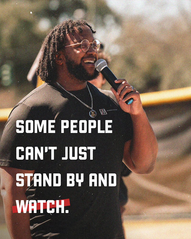
Vagabond Missions builds friendships with teens in urban and inner-city communities, meeting them where they are in neighborhoods, parks, schools, and youth centers to bring them the Good News of Jesus Christ.
After a season of change, Vagabond found themselves ready for a brand that better reflected who they had become. Their existing messaging and visual identity were too “corporate” for the grit, joy, and relational nature of their mission. They needed a brand that felt more connected to their missionaries and more recognizable to the young people they serve.
That’s why they called 5 Stones. Our agency led an all-day branding session to explore their personality, values, audience, and brand story. We also worked closely with their team on a new visual direction, landing on a more raw urban look.
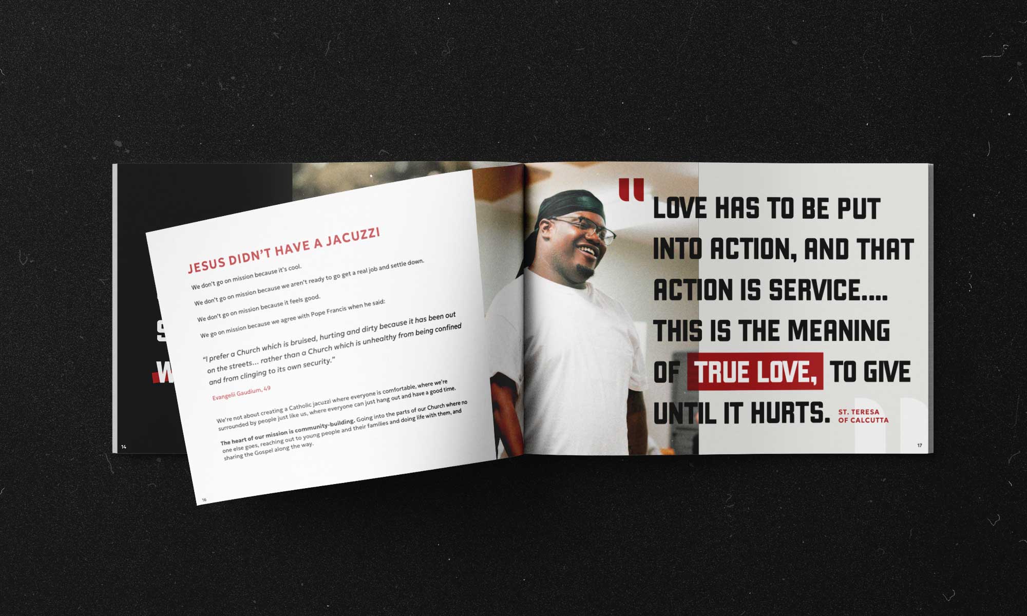
Our team delivered a comprehensive brand book that defines what it means to look and sound like Vagabond. The book includes a new logo and visual identity as well as written messaging that gave their team a clearer way to talk about their mission.
The result is a brand that finally feels like Vagabond! It fits the missionaries, the neighborhoods where they serve, and the young people they are trying to reach.
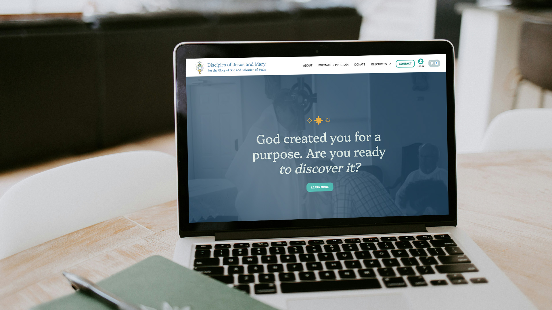
Vagabond Missions wasted no time putting the new brand to work. They updated their website using the messaging and visual identity and even painted their van with the new look and logo. With a stronger brand, their team is confident they will be able to reach more young people with the Good News of Jesus Christ.
Our messaging and visual work culminated in a brand playbook with everything the Vagabond team would need to showcase their powerful mission to their audience—including brand voice and tone, logos, fonts, colors, and much more. This resource gave Vagabond’s staff and missionaries the guidance they needed to bring the new identity to life and keep it consistent across every touchpoint.
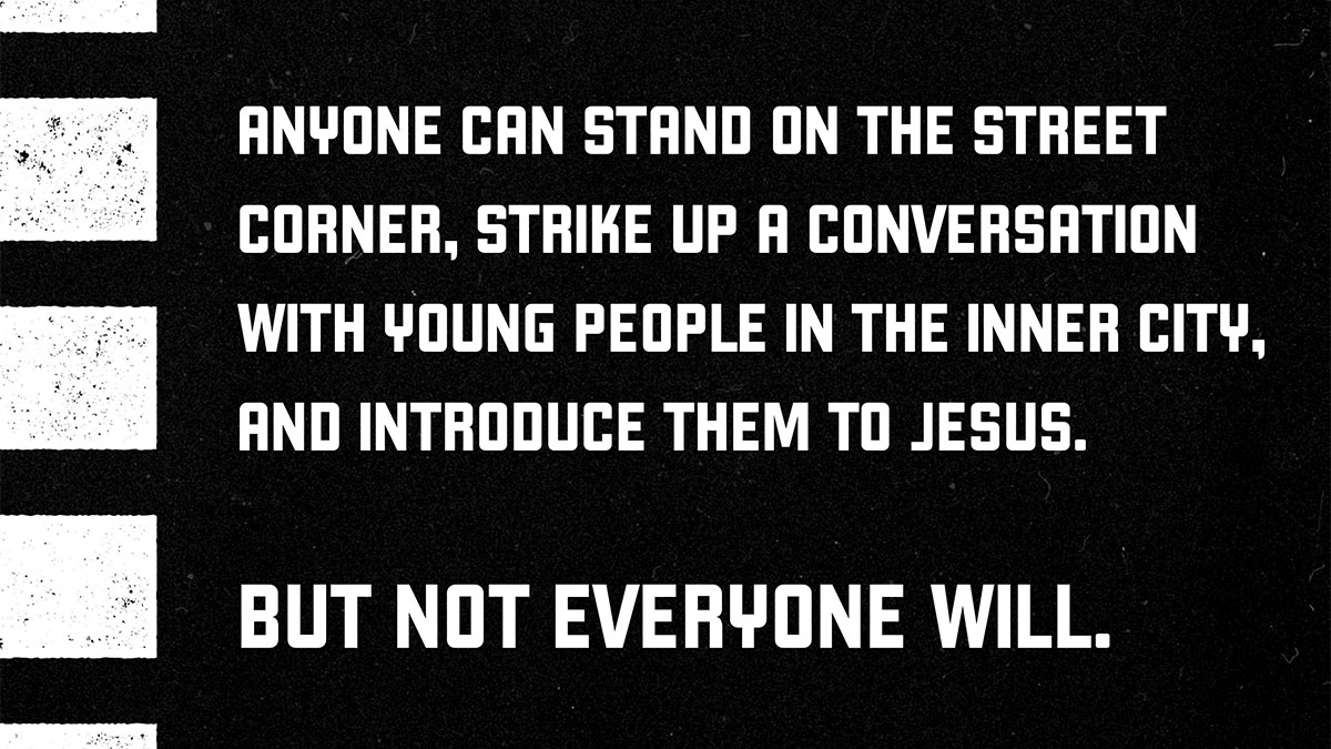
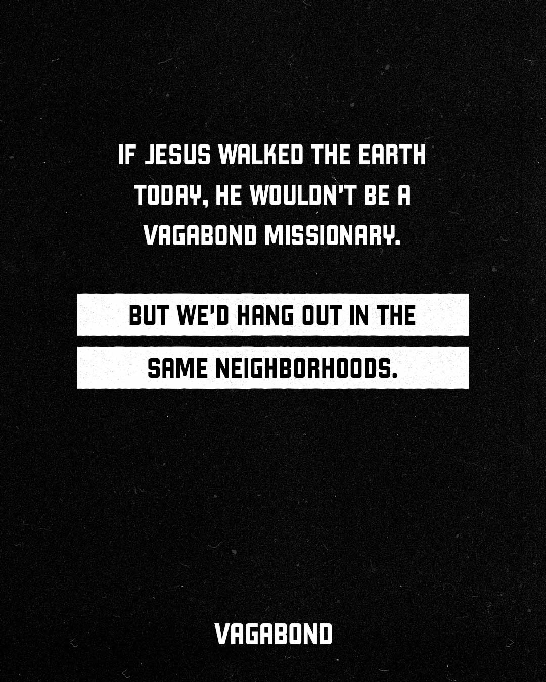
Vagabond missionaries serve where most people refuse to go, so their brand messaging has to be just as fearless. Copy that plays it safe or blends in with every other ministry just won't cut it. We wrote messaging with a backbone: confident and clear on exactly who Vagabond is for, what they do, and why their work matters.

When we started the process of rebranding with 5 Stones, our team at Vagabond Missions wanted a fresh look. What we discovered is that we needed a brand that reflected the hard work of our missionaries and inspiring faith of our young people. A huge thank you to the whole team at 5 Stones for guiding us through this process.
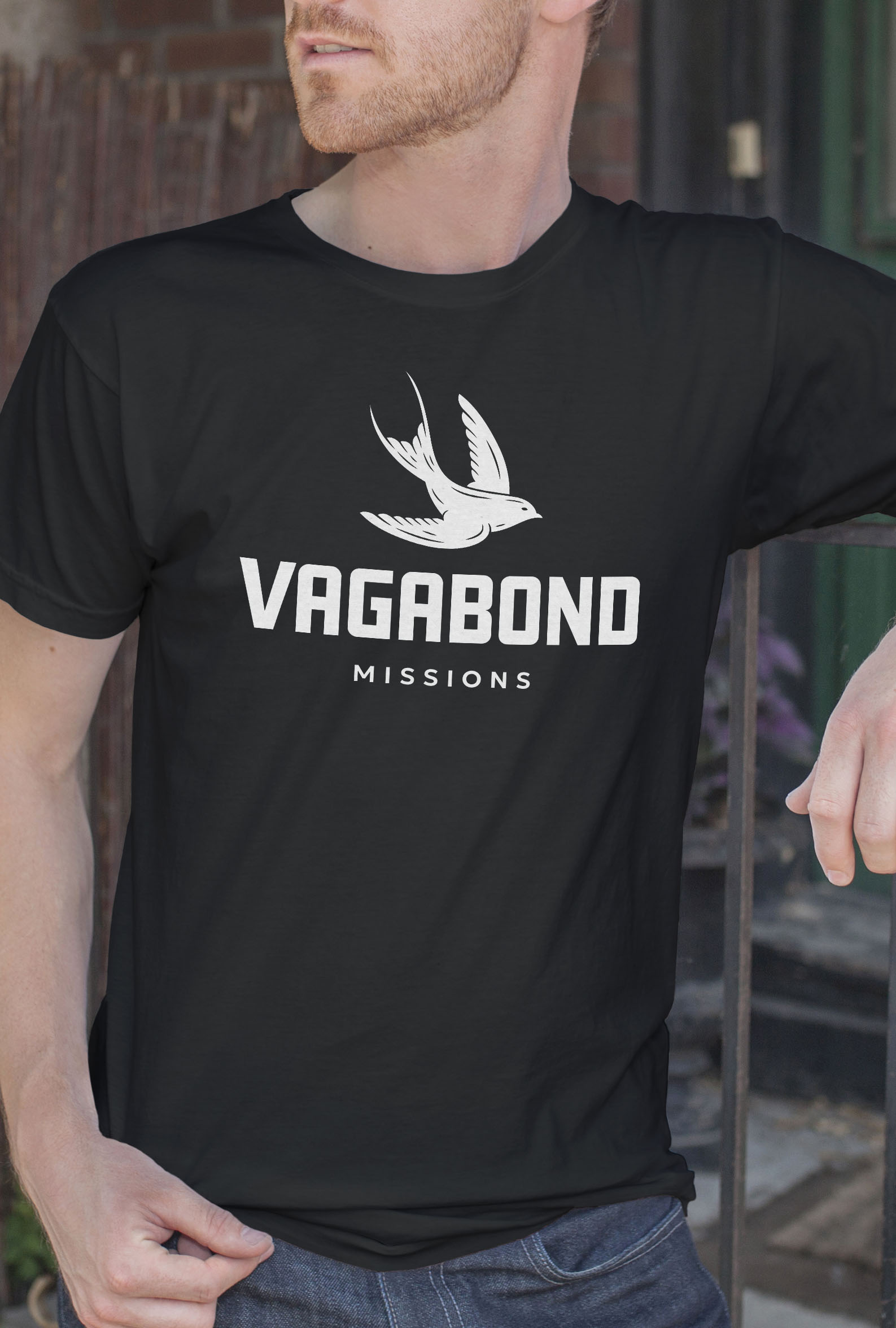
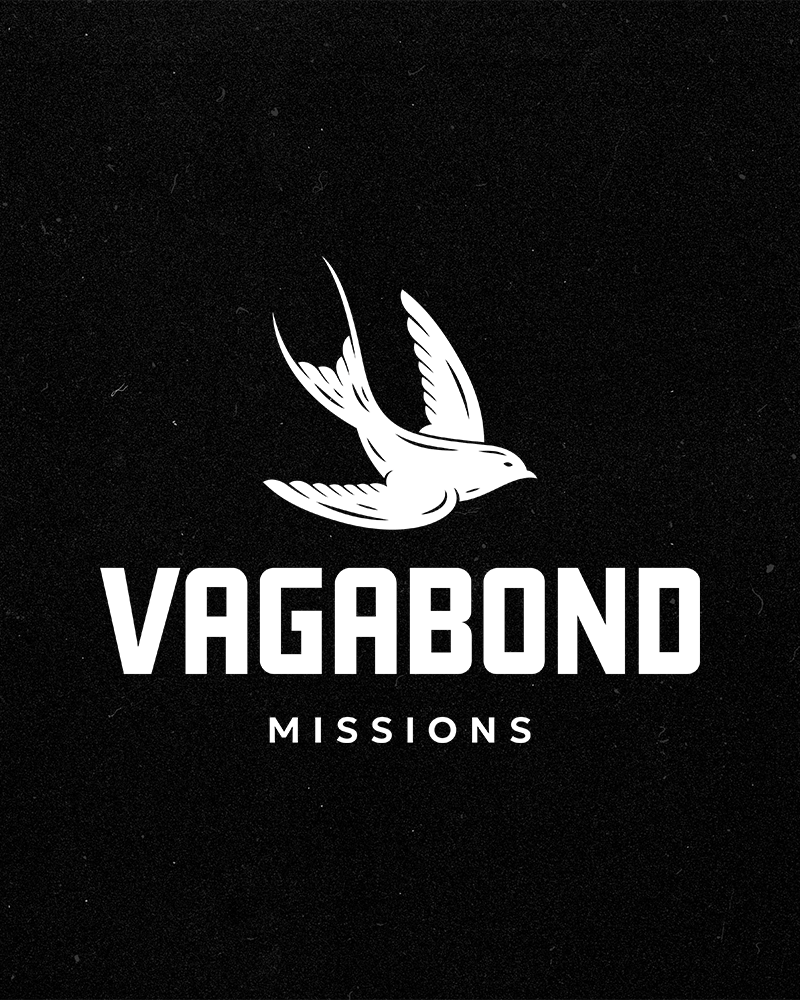
As we began the logo design process, it was clear that the Vagabond team was ready for a bold change. We landed on the swallow as the primary symbol for their organization. Simple, strong, and timeless, the swallow has long symbolized resurrection in Christian tradition. It was a perfect representation for Vagabond—reflecting the eternal impact they hope to leave through their mission.