Article Outline:
Your website does a lot of talking before anyone ever talks to you. That’s right—before they attend an event, make a donation, or even fill out a form, your audience is usually sizing you up online!
Fair or not, the first impression happens fast.
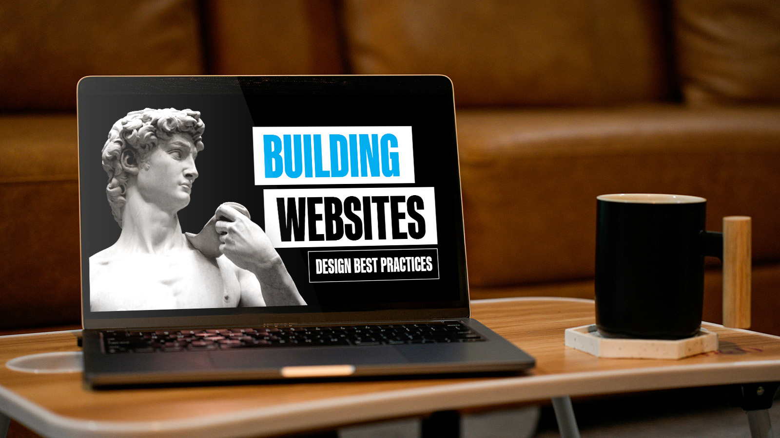
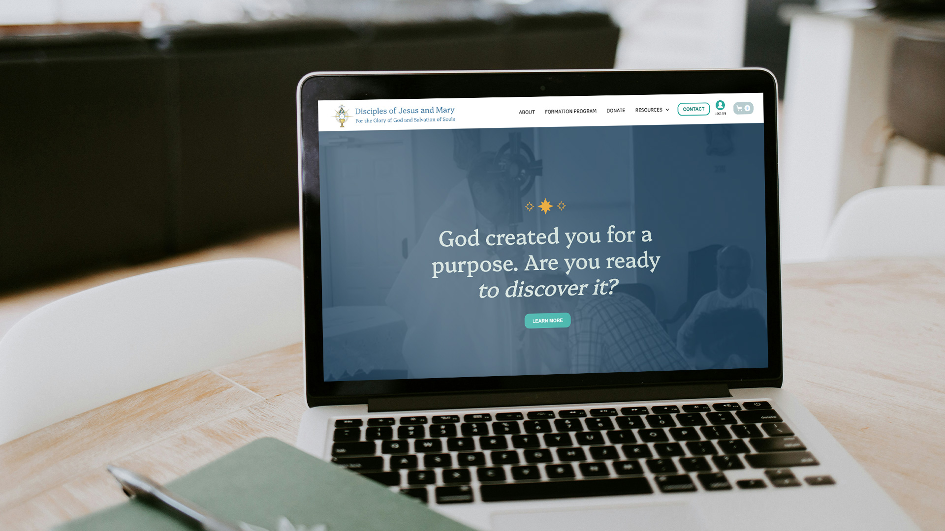
That’s why good Catholic website design is such a foundational part of how you show up for your audience. A strong site will help people understand who you are, trust what you do, and know what to do next.
It is important to start with a clear information architecture and wireframe of each page so you have an understanding of the flow of your site. What actions do you want users take? Which ones matter most? What should they see first? What can wait? What do you need them to know? If the answer is “all of it, immediately,” it’s time to take a step back and think about what you need your site to accomplish on the most macro level.

These questions help you decide what belongs where and make the site easier to navigate for both humans and search crawlers. Without that clarity, it is easy to end up with a website that looks polished but feels scattered. That is a rough combination.
If the structure is unclear, pretty graphics can only do so much. A beautiful website that confuses people is still a confusing website.
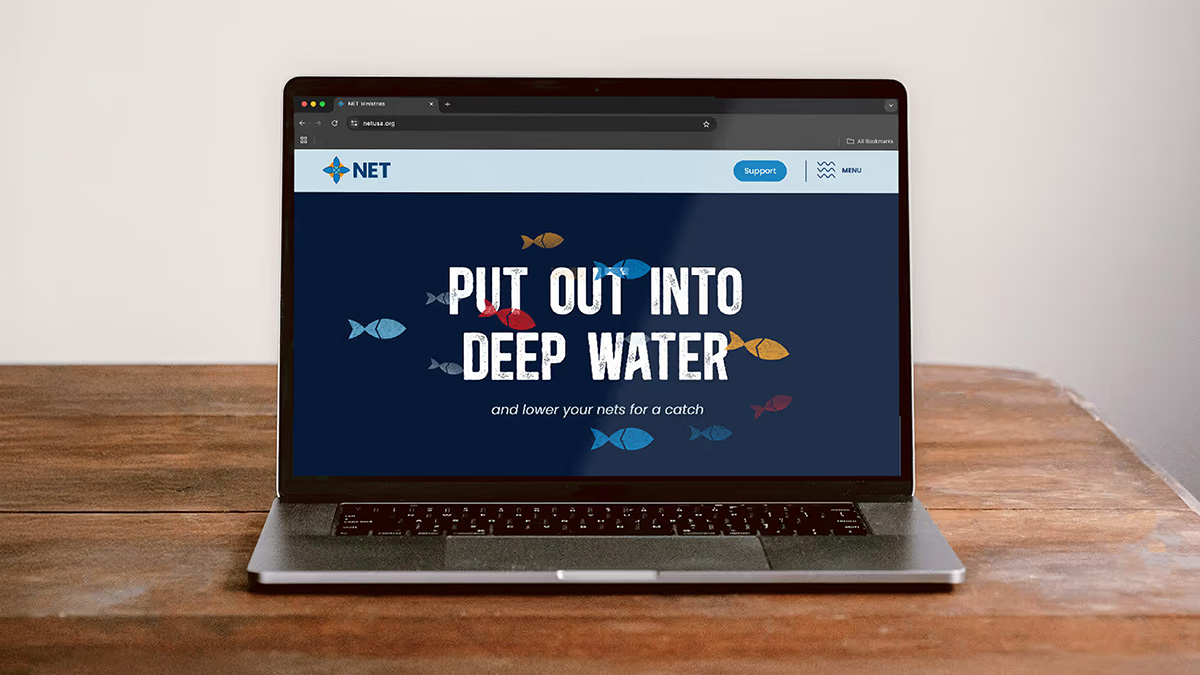
Nobody has ever whispered, “Wow, what a spiritually enriching hover effect.”
And yet, small details on a Catholic website can do a lot. Find ways to surprise and delight users with unexpected elements on your website. That could mean unique hover effects, engaging scroll animations, load animations, or other thoughtful touches that make the experience feel a little more polished and enjoyable.
It’s important to remember that these elements should enhance the experience of your website, not distract from it. A little goes a long way.
When those details are done well, they add personality and help the site feel more intentional. When they are overdone, they start pulling attention away from the content itself.
If a user lands on your website and doesn’t immediately know what you want them to do next, something needs to change.
Not every web visitor will be at the same point on their customer journey. Different users are ready for different kinds of next steps, so your site should create more than one opportunity to engage. That might include a newsletter they can sign up for, a lead magnet they can download, an event registration, or a contact form.
You should have a clear understanding of what your primary call to action is and what actions are secondary. Your website design should reflect that hierarchy, and your modules should be geared toward those actions. Never make users hunt for a button. When the action hierarchy is clear, the whole site feels easier to use.
If you’re ready to refresh your Catholic website or need to build one for the first time, our fantastic team of Catholic web builders and graphic designers would love to help! You can contact us here to get started.
A strong Catholic website should be easy to find, easy to use, and easy to understand. That sounds obvious, but plenty of sites still manage to make all three harder than they need to be.
Optimization is where a lot of that gets sorted out. This is the work that helps your website perform well for actual people and for search/generative platforms trying to decide what content to serve to users. This is where the details start earning their keep.

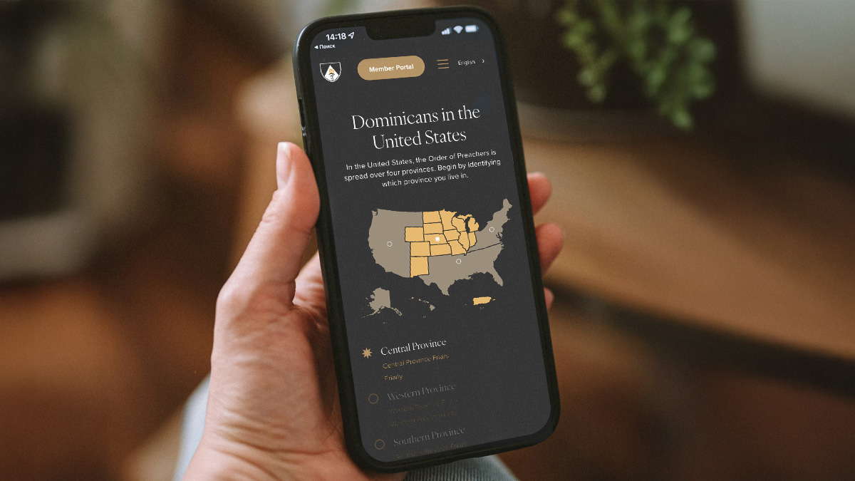
A majority of users will be experiencing your website on mobile. That means the mobile experience deserves real attention, not a quick glance at the end once the desktop version is finished.
Text should be readable. Buttons should be easy to tap. Menus should make sense. Forms should be simple to complete. If someone has to pinch, zoom, or jab at your navigation with surgical precision, the site is asking too much of them.
Desktop still matters, of course. Many users will explore your site there too, especially if they are researching, shopping, or filling out longer forms. But in most cases, mobile is where first impressions are happening.
Make sure users with disabilities, such as color blindness, can still navigate your website.
These are not fringe concerns. They are part of building a site everyone can actually use.
Your site should also be SEO (search engine) optimized. Heading tags, meta descriptions, clearly organized page structure, alt text, and internal linking all matter more than you might realize.
When your content is organized well, your headings make sense, and your pages are structured around real user intent, search engines have a much easier time understanding what your site is about. Conveniently, you already did this when you were planning to make the website easier for people to navigate.
AEO, or answer engine optimization, is the practice of structuring your content so it is easier for AI tools and search engines to pull direct answers from your site and know when to reference your organization. You may also hear it called GEO, short for generative engine optimization. The language is still settling, which tells you a lot about how quickly this space is changing.
With the rise in AI, more people are searching in natural language, and more platforms are responding with summarized answers instead of a simple list of links. If you want AI to highlight your organization in its responses, your content needs to be clear and well structured so AI crawlers can decipher it quickly and easily. A strong FAQ section gives them what they are looking for—clear headings, direct answers, and an organized page structure—in a format people are already familiar with.
Best practices here change quickly as the technology shifts, but it is already worth factoring into how you build and write for your site.
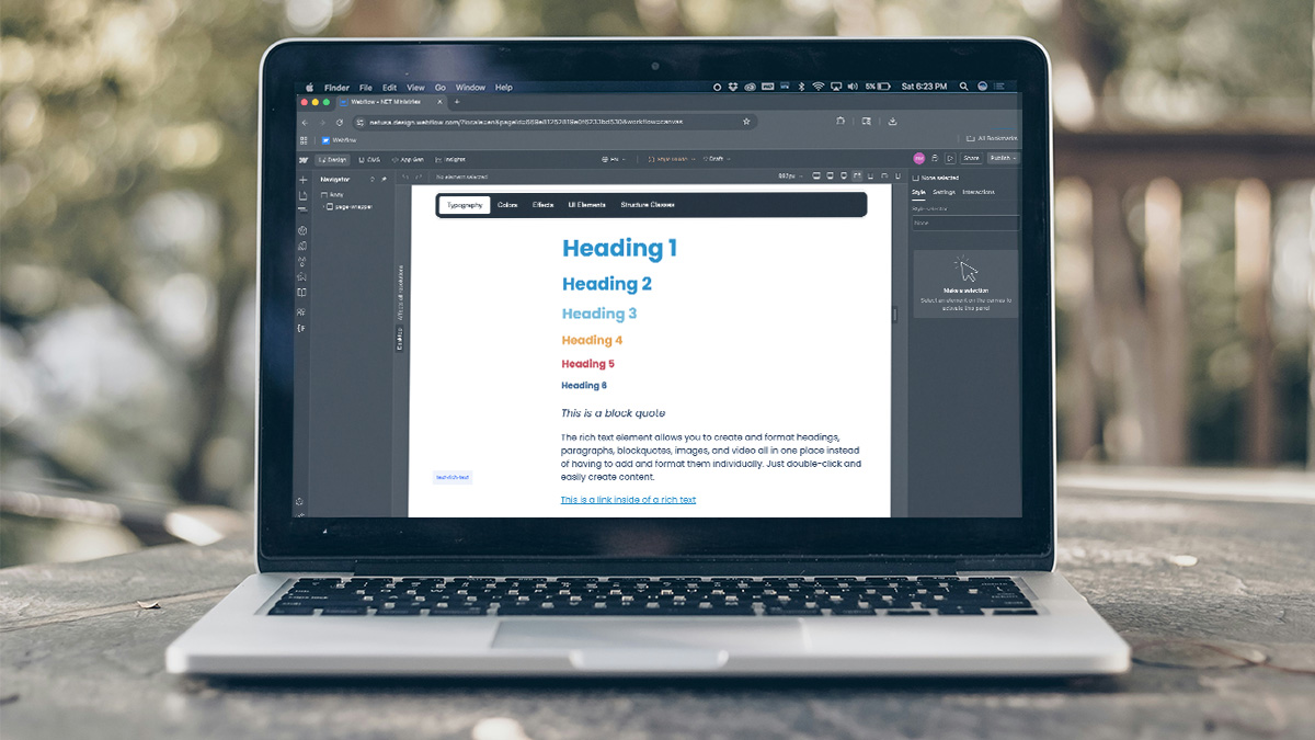
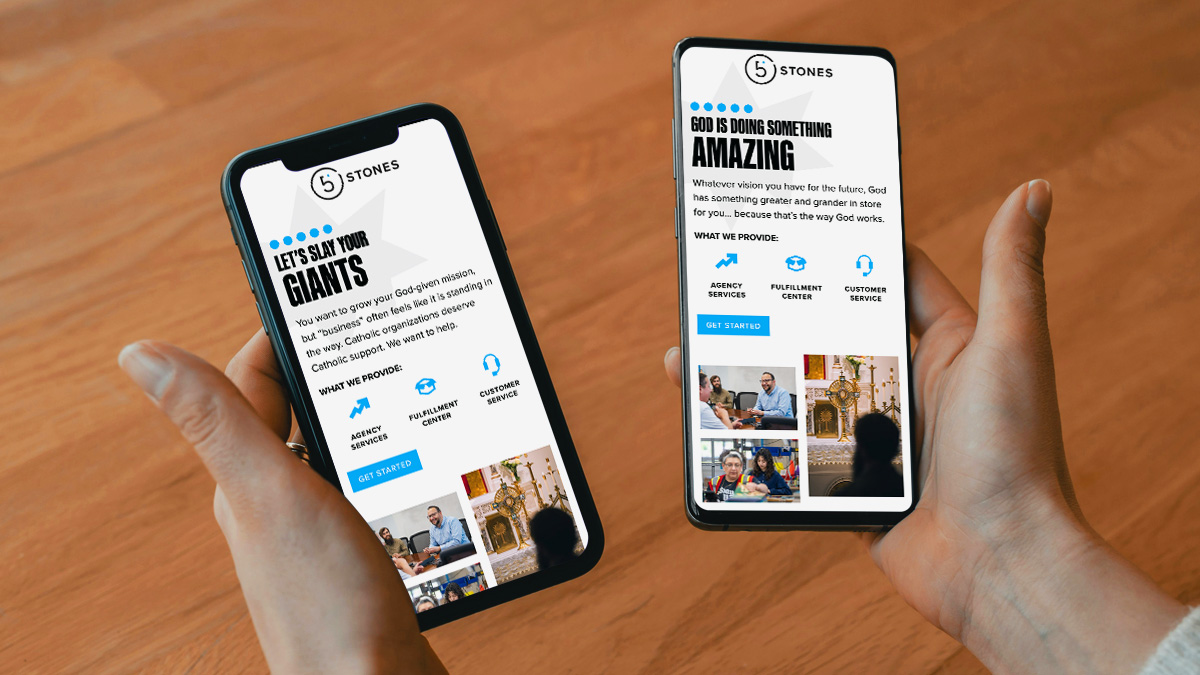
Your website should feel like it is all part of one brand. Using color, type, and sizing elements consistently will help your users have a positive experience of your brand.
There should also be a clear sense of what to notice first. Is it obvious what information is the most important? Are you guiding users through the page in a way that feels natural? A lot of that comes down to restraint. When every section is trying to be the star of the show, the page starts working against itself.
That same rule applies to your copy. Do not overburden your website with novels worth of text that users will likely skip. TL;DR is real. Say what needs to be said, say it clearly, and then give people a way to go deeper if they want to.
Your main pages should help people get the point quickly and keep moving. A blog post, a secondary page, or another resource can carry the extra detail.
Once your website is live, you finally get to see how real people are using it. That gives you a chance to learn what is working and where people may be getting stuck.
One of the clearest ways to explore user behavior is through A/B testing. This is where you compare two versions of the same element to see which one performs better. That could be two headlines, two images, two button styles, or two versions of a form.
Sometimes the version everyone is convinced will win does not. (A useful exercise in humility. Which, as Catholics, we are obligated to call a growth opportunity.)
You can keep building on that insight with tools like GA4, Google Tag Manager, heatmaps, and session recordings. Those tools help you see where people are clicking, where they drop off, and which calls to action are actually getting attention. Over time, that kind of feedback helps you make smarter decisions and create a stronger website experience.
This should go without saying, but sometimes this oversight is the biggest gap that keeps a website from serving an organization as well as it could.
Once users give you their information, it should actually go somewhere. Integrate your site with your CRM so new contacts do not disappear into the digital void. A website should help your team follow up, stay organized, and keep building relationships over time.
If you’re thinking through (or rethinking) the design of your Catholic website and want a trusted partner in the process, the team at 5 Stones would love to help!


